We’ve all been there
If you’ve ever opened an online account, you’ve probably run into a site that just makes your blood pressure rise. We’ve all been there before, you’re trying to setup an account for that new service, and every time you submit the form, there seems to be some new password requirement that wasn’t required before.
Minimum of 8 characters!*
okay, submit again.
You need a number!*
okay, submit again.
You need a special character!*
okay, submit again.
You need a password you haven’t used before!*
OKAY, SUBMIT AGAIN!
Sorry, we can’t process your request at this time!
Contact support.
Or, you’re reading a blog and the text is making your eye’s hurt because it’s too small (too small) or there is not enough contrast (enough contrast) between the text and background. Perhaps you’re trying to find information on a site and it says:
Please click here for help on our services!!
Did you have to think about which element was the actual link? You shouldn’t have too! The design choices web designers make when building websites will directly impact the emotions of the real people using those sites.
Think about the password example above. How much easier is it to fill out passwords when there are conveniences like viewing the hidden characters to make sure your password is correct? What about checkmarks as you complete the various requirements?
✓ 8 Characters or more
✓ At least one Number
✓ At least one Capital Letter
X Special Character: ! @ # $ % ^ & * ( )
That’s much easier! But why? This solution uses a combination of colors and symbols to highlight which requirements are met, making it more accessible. Design principles like the visibility of system status and user feedback provide you with clues to complete the task. There are entire teams at companies like Microsoft and Google, designing entire products and services around these types of interactions.
Interested why? It comes down to how we experience the web. User experience (UX) design is an approach to designing better experiences for the people who interact with our products and services. Since this is an introduction to UX, we won’t go too deep into the background theory of specific interactions like the visibility of system status, but you will learn about some key principles that we use at CH Web Agency to prioritize UX in our web design process and how you can too!

What is UX Design?
User experience (UX) design is the process of creating experiences that evokes specific emotional responses from users to your product or service during any possible encounter with your brand. You want these responses to be positive, whether a customer is checking out an item on your e-commerce site, at home unboxing your newest product of gourmet truffles, or calling the help desk because of a shipping delay. UX design is not limited to web or digital technologies, but today we will focus on how it applies to web design. When used affectively, UX design can be a competitive advantage for your organization, providing a way to deliver useful and desirable experiences that will delight your users and meet their needs (rather than frustrate them). This can lead to benefits such as increasing the number of return visitors to your site and improving your net promoter scores (how likely your users will recommend your product or service to others).
What makes a bad experience?
None of us wants to set up website visitors for a negative experience. Negative user experiences can result from any number of website missteps (including the examples above); an e-commerce site that has an inadequately designed and tested checkout process can lead to serious errors that prevent users from purchasing their items. Users will quickly forget that the site’s interface was beautiful, or that they found everything they were looking for, when they are ultimately unable to complete the desired task of checking out.
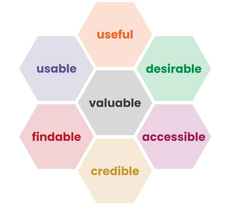
User Experience Honeycomb
So how can you get started with UX? It might feel daunting then to know how to start making UX a priority in your next web design project. Fortunately, a pioneer in the field of UX and a renowned information architect, Peter Morville, created the “User Experience Honeycomb” which I’ll use as a QuickStart guide to help you understand the different aspects of UX.
The UX Honeycomb provides a shared language in which to plan and strategize the end-user experience of a new website build or redesign, from the content of our sites to the aesthetics of each page. Now that you have seen the honeycomb, let’s dive into the different parts.
Useful
A good website user experience requires useful content or functionality for our users. An e-commerce site that sells truffles but doesn’t list their ingredients isn’t very useful to potential buyers, especially those with food allergies; this will likely result in few return visits. Badly written or erroneous content won’t be useful to readers of your cooking blog. 2 cups of salt? That can’t be right. Similarly, well written and unique content will lead to posts being shared on social media and prompt readers to return to the site for the latest chocolate chip cookie recipe. That same e-commerce site that provides not only images of delicious baked goods, but detailed information about the ingredients and potential allergens, is now much more useful to site visitors.
Usable
Maybe you already have great content, or perhaps you’re ready to sell that innovative new line of products or service. How can you ensure that your customers will be able to use your site or make new purchases without getting stuck by an issue with a form, or an add-to-cart button that doesn’t behave the way they’d expect? It comes down to whether your site is usable. The internationally recognized consulting firm, the Nielsen Norman Group, describes usability as designing a learnable, efficient, and memorable site that is error-free and pleasant to use.
Because usability deals with making a site easy to use and is thus a necessary aspect of creating a well thought out UX, it is important not to conflate it with being the sole consideration. Usability is just one part of a larger process to creating websites that deliver exceptional experiences.
In the example of the e-commerce checkout, usability is the “quality attribute” that allows us to qualify how easy it is for a user to add an item to their cart and then checkout. There are many considerations to designing a usable site. Fundamentally though, the design should make it possible for users to anticipate how the site will behave. Buttons and links should look and respond like buttons and links. This can be accomplished by building sites using modern web standards and designing components of the site that are consistent with established design patterns (for e-commerce sites, this could be having a shopping cart icon in the upper right corner). You want your visitors to be able to quickly learn and remember how your site works.
To make sure that a site is usable, UX designers will conduct Usability testing, something we’ll cover in more detail in a later post. This is an important part of building usable sites. It involves real or representative users who complete actual tasks while using your website (such as finding the chocolate truffles, adding it to the cart, and checking out); by watching users interact with your design, you can make informed improvements. Usability testing can be especially critical if you are designing custom user interactions, such as fancy one-of-a-kind navigation systems. Users will be unfamiliar with these kinds of one-off designs and will be more likely to get confused or frustrated.
Findable
Most sites have content that caters to their users’ interests. This information needs to be findable. Imagine you’re on your way home and stop at your local grocery store to buy cheese for tonight’s dinner. You head to the dairy section. Butter, milk, and no. You don’t find cheese. It’s not there! Several minutes later, you find it in produce section next to the kale and bok choy. Whether users can learn and remember how to use a site can greatly depend on if information is findable. Carefully designing the organization of content, labeling of menus, and overall structure of information on your site is called information architecture (IA). And, just like in a grocery store, organizing content with a clear strategy, in a way that your users expect, is a critical step to making it possible for them to find what they need.
Accessible
Millions of people live with disabilities; and they will find it much more difficult or even impossible to use or find content on your site if it is not accessible. Building accessible websites has often been brushed aside, even by large organizations, or only considered as an afterthought. However, nearly 1 in 4 U.S. adults live with a disability. So, it is not just the ethical choice, making your site accessible is necessary to stay competitive. Meeting accessibility requirements often benefits more than just those with disabilities, simple steps such as making sure your text has sufficient contrast and your forms are well labeled improves the user experience of the site for everyone.
Desirable
Thinking about the desirability of your website will help you create a plan to set it apart from the many well designed and functional sites already out there. Desirability can be impacted by your brand identity, your use of imagery on the site, the story you tell your users, and the overall visual aesthetic of the UI. Users will form impressions of your site very quickly (50 milliseconds), so it will be important to plan out and remain consistent with the look and feel of your brand throughout the website. During the pandemic, websites have become more critical to how users experience our brands. Think about some websites you frequently visit and why; what made you choose one streaming service over another? What design elements, branding, and other factors gave them that edge that made them more desirable to you.
Credible
Website credibility is about gaining trust and retaining users on your site. A non-profit with no board of advisors or public face may make users suspicious of the legitimacy of the content and causes. An e-commerce site with no return policy or contact information would certainly warrant a closer look. Researchers at Stanford’s Persuasive Technology Lab studied how website designs affect users trust of a site and the information they encounter. Their “10 guidelines for building the credibility of a website” provide an excellent means to get started.
Top 5 guidelines for building credibility:
- “Make it easy to verify the accuracy of the information on your site.
- Show that there’s a real organization behind your site.
- Highlight the expertise in your organization and in the content and services you provide.
- Show that honest and trustworthy people stand behind your site.
- Make it easy to contact you.”
Valuable
And finally, a website must bring value to those who run the site and those who use it. Are you a non-profit, on a mission to advocate for an underrepresented group? Or maybe you’re a small business trying to ride out the pandemic by bringing in a new source of revenue. New business owners might launch an e-commerce site; they will gain value by sustainably selling products and services to help grow their business. For the consumers, the products and services offered must meet a specific need for a fair price. Disrupt this balance, and the site does not work. Consumers won’t purchase the goods if the costs are too high or the products are inferior, and businesses won’t survive very long if they don’t earn a profit from sales.