At some point during the design and development of your website, or maybe even after the launch, you determined that you needed a better way for users to find content.
How Nonprofits Can Make Finding Resources Easier With WordPress
Table of Contents
The success of your nonprofit’s mission, and the ability to move closer to your vision for the future, depends partly on your team’s ability to effectively disseminate information to a larger audience or the general public.
Your organization is already making a difference and your communication team is working hard to write stellar content, share key learnings, and provide resources. So, how do you make it easier for your users to find the content you post, weeks, months, or years after it’s been published? Filters provide one way to narrow your content down from everything your organization has ever published to a specific search query.
What a typical WordPress website will include for nonprofits

A typical WordPress website solution will include a simple blog with pagination. A blog is a series of articles that have a basic structure. Usually this includes a heading, body, featured image, and some terms to organize the content.
The page that displays the full content of your blog article is referred to as a single post template. It determines how the heading, body and featured image will look on the page, along with any terms, author information, and the date that the article was published.
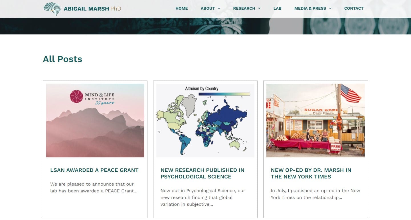
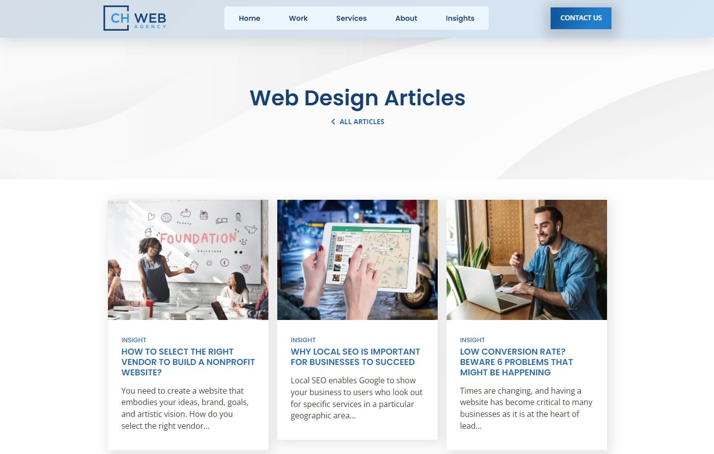
A card template is used to display a partial rendering of the content on a page with other cards. This allows users to browse all your posts before selecting one they wish to read. This page is often referred to as your “blog”, and has your cards aligned in a grid format.
Pagination refers to the numbers at the bottom of the page. As the name suggests, content is broken up across pages. Pagination allows users to share or return to a specific page of content. This can be a more accessible solution than infinite scroll, which can be difficult to bookmark. More on accessibility later. Most themes and page builders will support this basic blog setup.
Searching your nonprofit’s blog posts for keywords and terms

Adding a search bar to your website is a step above a simple blog format with pagination. A search bar, featured in your header or footer, allows users to search for specific terms. The search will lead them to what WordPress refers to as an archive page. It is a simple filter system that narrows down all possible blog posts to just articles that match the user’s search terms.
Archive pages are templates that pull in posts by the searched keyword or term, and display all posts that match the search. Depending on the customization of your website, the archive page may look very similar to your blog, with a heading that matches your search.
Archive pages are very similar to your blog page, however, they only show posts that match the searched keyword or term. Taxonomy is a “fancy word for the classification/grouping of things. Taxonomies can be hierarchical (with parents/children) or flat.” WordPress categories and tags are examples of taxonomies. Clicking on a category or tag link for a post will take a user to an archive page of all posts that match that term.
Try it out, view an archive page for the category web design on our website here at CH Web Agency.
If an archive page meets your needs, ask your web developers about implementing a custom archive page and providing the additional search functionality for your website. Looking for WordPress experts? CH Web agency is a full-service web design agency!
Limitations of archive pages

A typical archive page requires the user to leave the page they were on, usually from a search query or after clicking on a related term on a blog post, in order to see the results of their search. Many website implementations will have just one archive page, meaning that different types of content will be served up in the same blog template. Archive pages are not bad, they serve a valuable purpose and can meet the needs for many website owners. They “filter” the content, but it is a single filter system. Archive pages quickly break down when users are frequently looking for specific resources or answers, and need a more advanced filter system.
Additionally, during user testing, our agency found that users may overlook the search bar in headers. Dismissing it all together sometimes, thinking that the search results will not be relevant.
Creating a filter system that works for your nonprofit’s content

Creating an advanced filter system for your website requires taking a step back to understand how your content needs to be filtered. When clients ask us for filters, what they are actually asking for is facets. The difference can be described as “filter means anything that analyzes a set of content and excludes some items. Faceted navigation is composed of multiple filters that comprehensively describe a set of content.” – Nielsen Norman Group, a trusted ux research firm.
Archive pages are filter systems, they narrow the content down by one term or by a single search query. A more complex system requires more than a filter, it requires faceted navigation.
Common filter types include dropdowns, checkboxes, radio buttons, search fields, ranges, and datepickers. Combining these creates a faceted navigation system. As Nielsen Norman Group explains, faceted navigation is more powerful at a cost. Development of the system is more complicated and requires that extra data be assigned to the content being filtered.
That means, you need to write the code for the filters to work. On the technical side of things, dropdowns need to work like dropdowns, and the posts matching the term selected need to be pulled from the database and rendered on the screen. And, on the content side, your writers will need to assign the data to each post that the filters will act upon for all posts moving forward.
Filtering your resources by content and by taxonomies

In WordPress terms it means that posts need meta data to be assigned to each post in order for the post to show up when those filters are applied. For example, a nonprofit may want to provide users with the ability to filter the type of content, such as videos, podcasts, articles, and fact sheets. Additionally, they may want to assign categories to the different topics such as articles on the environment, elections, or health.
In WordPress, this would require having two taxonomies, one taxonomy for the types of resources and one for categories. This would allow users to filter by two different taxonomies in addition to your standard search functionality. They may also want to sort the posts by date or title in ascending or descending order. Combining all of these creates a faceted system.
Does your nonprofit website need additional taxonomies?
While multiple filters can prove invaluable to your users, determine if your particular use cases justify the added development costs. Consider conducting user testing to determine if website users are having difficulty finding resources on your nonprofit’s website. Surveys may also be helpful in determining if your users are having difficulty finding what they need. If they can’t find what they are looking for, determine if this is because the resource does not exist or if it is difficult to find with the current system.
Adding a filter system may be easier than you think, depending on your theme and page builder
As Nielsen Norman Group mentions in their article on Filters versus Facets, designing a custom filter system will increase the development costs of the project. If you have determined that you need an advanced filter system (known as facets), check if your current theme and page builder works with any robust filter plugins. Implementing a well-supported filter plugin can be significantly cheaper than a more custom solution.
For example, here is a great article on filter plugins by Elementor, where they discuss the pros and cons of how each system works with their page builder.
Why testing WordPress filters for accessibility is important for nonprofit organizations
At CH Web Agency, we’ve come across a number of filter or facet plugins that work very well for visual users. However, during testing, we have identified that many plugins did not provide adequate keyboard or screen reader support.
Here are some common filters and examples of how they should work for keyboard and screen reader users.
Checkbox Filters
Keyboard users should be able to use checkboxes with the TAB key on their keyboard. Users should be able to check and uncheck checkboxes with their spacebar. Screen readers require an attribute to indicate which checkboxes are checked or unchecked.
An example of how checkboxes could work.
Radio Buttons
Keyboard users should be able to use radio buttons with the TAB key on their keyboard. Users should be able to select the appropriate radio button with their arrow keys. Screen readers require an attribute to indicate which radio buttons are checked or unchecked.
An example of how radio buttons could work.
Pagination
Keyboard users should be able to select the pagination with the TAB key on their keyboard. Users should be able to navigate through the page numbers with just a keyboard. Screen readers require an attribute to indicate which number is the current page, and the other pages should indicate they page numbers.
An example of how pagination could work.
Combo Box and Select
Keyboard users should be able to use combo boxes with the TAB key on their keyboard. Screen readers require an attribute to indicate when the box is expanded or closed.
Conclusion
Check with your developers that the chosen solution adds the appropriate roles, tabindex attributes, and aria attributes to make your filters accessible to visual, keyboard, and screen reader users. If you’re a developer who is new to accessibility in web development, we recommend checking out this phenomenal page on the subject of accessibility from W3C.
Reach out to our experts at CH Web Agency if you have questions about implementing accessible filter plugins in your next web development project.