Accessible Designs
User Friendly
- Designing an accessible website is part of our overall strategy for delivering a user friendly product.
- Website accessibility features make the site easier to use for everyone, improving the overall user experience.
- Text is easy to read, links are obvious, headings are clear, and users can access and navigate the website.
Website Accessibility Checklist
Website accessibility is typically measured against key criteria to ensure inclusivity and usability for all users, especially those with disabilities. These criteria are based on the Web Content Accessibility Guidelines (WCAG).
Easy-to-read
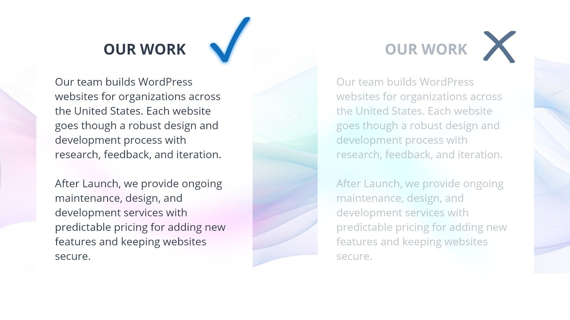
Users know what information is on the website and can access it. Meeting a minimum contrast ratio between text and background elements is one of our success criteria.
Keyboard Accessible
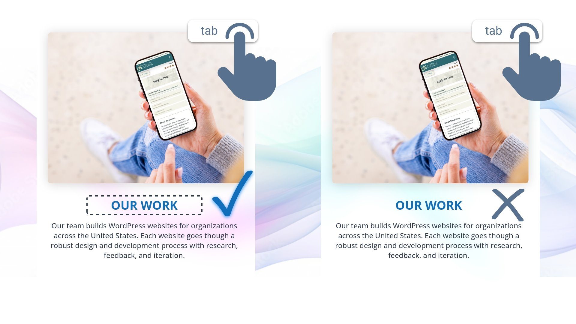
Users can operate the website navigation and interface. Navigating by only keyboard input is one of our success criteria.
Intuitive Navigation & Forms
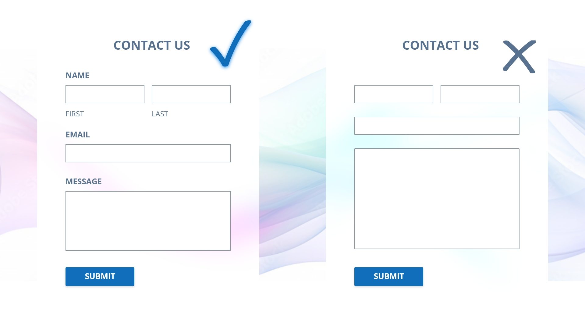
Users understand the website’s interface. Providing visible labels for form fields is one of our success criteria.
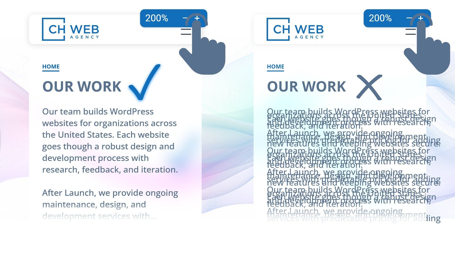
Robust Development
The website works with user agents, such as browsers and assistive technologies. Well written HTML is one of our success criteria.
Other Considerations
Our team conducts accessibility reviews and testing to guarantee a smooth website launch. Maintaining that level of accessibility after launch is possible with our robust templates and the training of client staff.
Edits & Changes
After launch, your team will take over the publishing of different types of content, press releases for example. Keeping a website accessible is an ongoing project that requires constant work from both teams. For example, if your team pastes links as URLS, https://example.website…, the website will automatically style the link in an accessible way, so users can easily identify it as a link. However, the link text itself is not as accessible as link text that clearly states the destination and function of the link, a WCAG accessibility requirement.
Staff Training
Our agency provides training after launch and access to our free knowledge base. These tools help organizations maintain an accessible website after launch. It is important that anyone posting content on your website learn a few basic requirements of writing and posting accessible content. Check out our knowledge base to learn about making headings, links, and images more accessible to users.
Accessibility Review
Our agency performs a major accessibility review of the website before launch. This review includes looking at the website through several different accessibility lenses. Our team will use automated tools to check for errors in contrast, link text, and html tags. We will perform a variety of responsive device and browser tests to ensure the website works with user’s preferred device. We conduct screen reader tests on all pages and samples of each post type. Screen reader testing allows us to check that users can navigate the website with assistive technologies in a predictable way.
Additional Accessibility Criteria
These are some additional criteria to consider when building an accessible website:
- Responsive Design: Ensure the website is optimized for different screen sizes and devices, making it accessible to mobile and desktop users alike.
- Skip Navigation Links: Offer skip navigation links to help users quickly reach the main content, which is especially helpful for those using screen readers.
Accessibility Widgets Are Not Enough for Screen-Reader Users
Website accessibility widgets add little value in making your site accessible to users with partial or no vision.
Watch Youtube video from Nielsen Norman Group about the Accessibility Widgets.